Meet our Designer
Monique Reeves (she/her)
From International Tattoo artistry to a coin designer for the Perth Mint, Monique Reeves has made their mark on the art world. Mon describes herself as a bilingual, tattooed, Medical Illustrator and extremely outgoing graphic designer with a love for isometrics, infographics and typography. We describe her as an award-winning graphic designer (Adobe Illustrator of the year 2017, Beaumont Award Winner 2019, Awarded entry to the International Society of Typographic Designers) who has designed for Nike, Adobe and almost every Health Department in WA. As part of their day-job as a medical artist and graphic designer for the WA Department of Health, Mon’s medical illustrations have been published in international and Australasian medical journals. Mon has a passion for pushing the boundaries of graphic design and, luckily for us, supporting LGBTQIA+ community causes in their spare time.
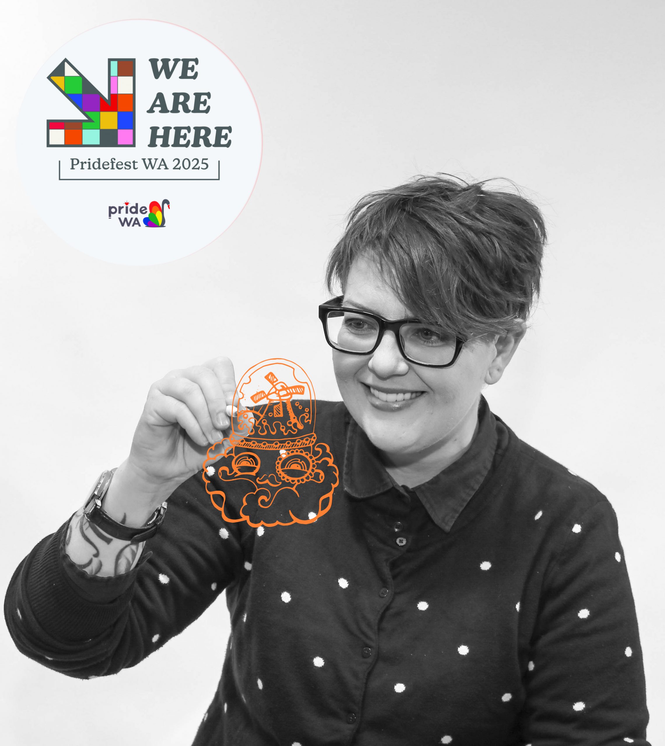
We’re proud to be partnering with Mon [Monstar Designs (@monstar_dsgns)] as our Theme Designer for Pridefest 2025.
The concept Monique pitched to Pride WA powerfully reflects the protest elements of the Pridefest 2025 theme. The concept is a tribute to the 1969 Stonewall riots in New York, which served as a pivotal moment in the fight for LGBTQIA+ rights, increasing pressure for law reform and the crystallisation of the concept of ‘Pride’. The visual design of the Pridefest 2025 theme pays homage to the artistic talents of New York’s own Ellsworth Kelly (1923–2015) and subtly the links back to the Stonewall riots by using the Walbaum typeface, the closest match to the lettering seen on Stonewall protest banners.
The colour palette isn’t just your basic ‘off the shelf’ rainbow either. Each colour in the Pridefest 2025 theme concept represents a uniquely West Australian object: light blue from the Omeo Wreck, pink from Hutt Lagoon, brown from Elephant Rocks in Albany, green from the Heart-Leaf Mallee. We’ll leave you to guess the rest!
Q & A with Mon
Mon: Giving back has always been a big part of who I am. Being a designer, and gay, I understood this was more than rainbow aesthetics but about shaping culture and fostering meaningful change.
Mon: I hope it builds excitement and momentum as well as fostering inclusive dialogue and an interest in the storied background of this year’s ‘non stereotypical’ visuals.
Expression of collective and individual identity and a nod to the history of pride.
“We are here”…Wow, what a statement!
Representing a powerful brief centered on position and protest—embodied in the statement, “We are here!”— has presented an inspiring challenge. My several visits to Stonewall in New York City deepened my understanding of the experiences of the LGBT community during the late 1960s. Pride, both then and now, remains fundamentally a form of protest. Like any compelling concept, the final design encompasses multiple layers of meaning.
This project seeks to convey a representative journey through the art of that era in New York City, linking the message of protest with expressive typography. Additionally, it introduces vibrant, textured elements that directly reference the cultural identity of Western Australia.